Showfoto/Perspective: Difference between revisions
Marked this version for translation |
|||
| (7 intermediate revisions by 4 users not shown) | |||
| Line 1: | Line 1: | ||
==Photo KDE Tutorial 1-5: Perspective Adjustment== | <languages /> | ||
<translate> | |||
<!--T:31--> | |||
{{GrafBreadCrumbs|1=Showfoto|2=Perspective}} | |||
==Photo KDE Tutorial 1-5: Perspective Adjustment== <!--T:1--> | |||
Unai Garro, Summer 2009 | Unai Garro, Summer 2009 | ||
<!--T:2--> | |||
Hi again. Yes, for those that thought I disappeared, sorry, I'm alive [[Image:Icon_mrgreen.gif]] Not having had internet connection for months, and the extra work I've had for a while has prevented me from posting any tutorials, but well, here we are again. | Hi again. Yes, for those that thought I disappeared, sorry, I'm alive [[Image:Icon_mrgreen.gif]] Not having had internet connection for months, and the extra work I've had for a while has prevented me from posting any tutorials, but well, here we are again. | ||
For those new to these tutorials, the goal is to show how to properly use existing | <!--T:3--> | ||
For those new to these tutorials, the goal is to show how to properly use existing KDE opensource applications, for improving your already great photos and to be proud about them. With the [[Special:myLanguage/Showfoto/Brightness|last tutorial]], we have already covered most tools to improve lighting in a photo such as curves, levels, brightness contrast and gamma tools etc. | |||
<!--T:4--> | |||
In this tutorial, the target is something most of us completely forget unless we pay attention to a photo. Something that can be as annoying as easy to fix: perspective distortion. Yes, believe me, this one tutorial will be much easier to follow than previous ones. | In this tutorial, the target is something most of us completely forget unless we pay attention to a photo. Something that can be as annoying as easy to fix: perspective distortion. Yes, believe me, this one tutorial will be much easier to follow than previous ones. | ||
<!--T:5--> | |||
I'll use the following photo as sample to describe the issue: | I'll use the following photo as sample to describe the issue: | ||
{| | <!--T:6--> | ||
{|class="tablecenter" style="border:1px solid darkgray;" | |||
|[[Image:PhotoTut5_1.jpg|500px]] | |[[Image:PhotoTut5_1.jpg|500px]] | ||
|} | |} | ||
<!--T:7--> | |||
At first sight, you may say it looks okay... but pay a bit more attention... doesn't it look like the building is bent? as if the walls are not straight upwards? Yes, that's what I was referring to. It may look natural in a photo, since we got used to it, but... the building actually doesn't look like that! | At first sight, you may say it looks okay... but pay a bit more attention... doesn't it look like the building is bent? as if the walls are not straight upwards? Yes, that's what I was referring to. It may look natural in a photo, since we got used to it, but... the building actually doesn't look like that! | ||
<!--T:8--> | |||
Follow up: | Follow up: | ||
So who's faulty here? Some will claim that the lens in the camera was crap. Well, I'd say the photographer was crap, instead (that was me | <!--T:9--> | ||
So who's faulty here? Some will claim that the lens in the camera was crap. Well, I'd say the photographer was crap, instead (that was me) [[Image:Icon wink.gif]] | |||
The problem isn't the camera and neither the lens. This effect is pretty obvious if you think what happens when you approach a building and look at it with a camera: | <!--T:10--> | ||
The problem isn't the camera and neither is it the lens. This effect is pretty obvious if you think what happens when you approach a building and look at it with a camera: | |||
{| | <!--T:11--> | ||
{|class="tablecenter" style="border:1px solid darkgray;" | |||
|[[Image:PhotoTut5_2.png|500px]] | |[[Image:PhotoTut5_2.png|500px]] | ||
|} | |} | ||
<!--T:12--> | |||
It looks correct right? Now lets approach the building more, look at it from the bottom part rather than front, and lets make the building much larger than us: | It looks correct right? Now lets approach the building more, look at it from the bottom part rather than front, and lets make the building much larger than us: | ||
{| | <!--T:13--> | ||
{|class="tablecenter" style="border:1px solid darkgray;" | |||
|[[Image:PhotoTut5_3.png|500px]] | |[[Image:PhotoTut5_3.png|500px]] | ||
|} | |} | ||
<!--T:14--> | |||
The further the building parts are, the smaller they look. So the top part looks smaller than the bottom part. | The further the building parts are, the smaller they look. So the top part looks smaller than the bottom part. | ||
<!--T:15--> | |||
That's exactly what happens in our original photo too. In that photo, I was very close to the building, at the bottom of it. It may not look like that, but that's because I was using a wideangle lens.. Then, the closer you are to the building, and the larger being it, the more pronounced the effect is. | That's exactly what happens in our original photo too. In that photo, I was very close to the building, at the bottom of it. It may not look like that, but that's because I was using a wideangle lens.. Then, the closer you are to the building, and the larger being it, the more pronounced the effect is. | ||
<!--T:16--> | |||
What would you have to do? Well, if at all possible, try avoiding this effect when taking the photograph. Position yourself further away from the building when taking the pic, and try looking perpendicular to the building, not looking up. | What would you have to do? Well, if at all possible, try avoiding this effect when taking the photograph. Position yourself further away from the building when taking the pic, and try looking perpendicular to the building, not looking up. | ||
If everything fails, ... tadaaaah! yes, | <!--T:17--> | ||
If everything fails, ... tadaaaah! yes, '''Showfoto''' comes to the rescue here! | |||
<!--T:18--> | |||
Let's open the picture in '''Showfoto''', and look in the menu for <menuchoice>Transform -> Perspective Adjustment...</menuchoice> | |||
{| | <!--T:19--> | ||
{|class="tablecenter" style="border:1px solid darkgray;" | |||
|[[Image:PhotoTut5_4.png|500px]] | |[[Image:PhotoTut5_4.png|500px]] | ||
|} | |} | ||
<!--T:20--> | |||
Once selected, you should see a dialog similar to the following: | Once selected, you should see a dialog similar to the following: | ||
{| | <!--T:21--> | ||
{|class="tablecenter" style="border:1px solid darkgray;" | |||
|[[Image:PhotoTut5_5.png|500px]] | |[[Image:PhotoTut5_5.png|500px]] | ||
|} | |} | ||
<!--T:22--> | |||
In this dialog, you can move around the corners and stretch the picture in any shape you want (it applies a transformation matrix). You can use the dotted guide in the picture to make sure that the parts you want straight are vertical or horizontal. In this photo, I took building walls and trees as reference, and tried straightening them: | In this dialog, you can move around the corners and stretch the picture in any shape you want (it applies a transformation matrix). You can use the dotted guide in the picture to make sure that the parts you want straight are vertical or horizontal. In this photo, I took building walls and trees as reference, and tried straightening them: | ||
{| | <!--T:23--> | ||
{|class="tablecenter" style="border:1px solid darkgray;" | |||
|[[Image:PhotoTut5_6.png|500px]] | |[[Image:PhotoTut5_6.png|500px]] | ||
|} | |} | ||
And there you go, press | <!--T:24--> | ||
And there you go, press <menuchoice>OK</menuchoice>, and I got the following result: | |||
{| | <!--T:25--> | ||
{|class="tablecenter" style="border:1px solid darkgray;" | |||
|[[Image:PhotoTut5_7.png|500px]] | |[[Image:PhotoTut5_7.png|500px]] | ||
|} | |} | ||
Obviously, after reshaping the image, the borders are no more square, and | <!--T:26--> | ||
Obviously, after reshaping the image, the borders are no more square, and '''Showfoto''' has filled the missing parts with black. Now, we'll have to crop this ugly border off (take care when undistorting, because you may leave some image parts off for cropping!) | |||
And yes, we are done. Doesn't it look more natural this way | <!--T:27--> | ||
And yes, we are done. Doesn't it look more natural this way [[Image:Face-smile.png|12px]] | |||
{| | <!--T:28--> | ||
{|class="tablecenter" style="border:1px solid darkgray;" | |||
|[[Image:PhotoTut5_8.jpeg|500px]] | |[[Image:PhotoTut5_8.jpeg|500px]] | ||
|} | |} | ||
Well, I hope you enjoyed this tutorial. I know... you guys that followed the tutorials so far, thought that this tutorial would end up being much harder... that's life. As far as you got a bit of taste for photos, KDE and photography is damn easy. See ya all next time! [[Image:Icon wink.gif ]] | <!--T:29--> | ||
Well, I hope you enjoyed this tutorial. I know... you guys that followed the tutorials so far, thought that this tutorial would end up being much harder... that's life. As far as you got a bit of taste for photos, KDE and photography is damn easy. See ya all next time! [[Image:Icon wink.gif]] | |||
<!--T:30--> | |||
[[Category:Home and Hobby]] | |||
[[Category:Photography]] | |||
[[Category:Tutorials]] | |||
</translate> | |||
Latest revision as of 05:54, 2 November 2020
Home » Applications » Graphics » Showfoto » Perspective
Photo KDE Tutorial 1-5: Perspective Adjustment
Unai Garro, Summer 2009
Hi again. Yes, for those that thought I disappeared, sorry, I'm alive ![]() Not having had internet connection for months, and the extra work I've had for a while has prevented me from posting any tutorials, but well, here we are again.
Not having had internet connection for months, and the extra work I've had for a while has prevented me from posting any tutorials, but well, here we are again.
For those new to these tutorials, the goal is to show how to properly use existing KDE opensource applications, for improving your already great photos and to be proud about them. With the last tutorial, we have already covered most tools to improve lighting in a photo such as curves, levels, brightness contrast and gamma tools etc.
In this tutorial, the target is something most of us completely forget unless we pay attention to a photo. Something that can be as annoying as easy to fix: perspective distortion. Yes, believe me, this one tutorial will be much easier to follow than previous ones.
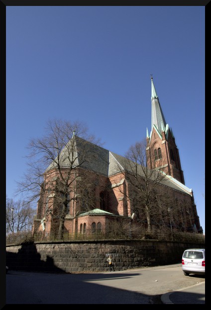
I'll use the following photo as sample to describe the issue:
|
At first sight, you may say it looks okay... but pay a bit more attention... doesn't it look like the building is bent? as if the walls are not straight upwards? Yes, that's what I was referring to. It may look natural in a photo, since we got used to it, but... the building actually doesn't look like that!
Follow up:
So who's faulty here? Some will claim that the lens in the camera was crap. Well, I'd say the photographer was crap, instead (that was me) ![]()
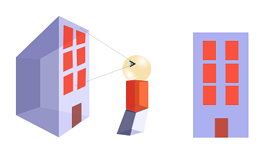
The problem isn't the camera and neither is it the lens. This effect is pretty obvious if you think what happens when you approach a building and look at it with a camera:
|
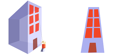
It looks correct right? Now lets approach the building more, look at it from the bottom part rather than front, and lets make the building much larger than us:
|
The further the building parts are, the smaller they look. So the top part looks smaller than the bottom part.
That's exactly what happens in our original photo too. In that photo, I was very close to the building, at the bottom of it. It may not look like that, but that's because I was using a wideangle lens.. Then, the closer you are to the building, and the larger being it, the more pronounced the effect is.
What would you have to do? Well, if at all possible, try avoiding this effect when taking the photograph. Position yourself further away from the building when taking the pic, and try looking perpendicular to the building, not looking up.
If everything fails, ... tadaaaah! yes, Showfoto comes to the rescue here!
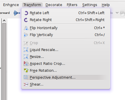
Let's open the picture in Showfoto, and look in the menu for
|
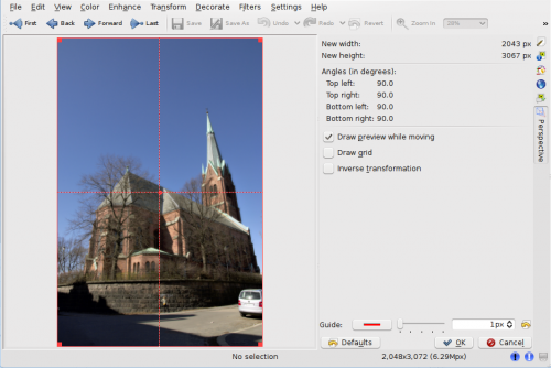
Once selected, you should see a dialog similar to the following:
|
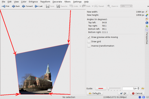
In this dialog, you can move around the corners and stretch the picture in any shape you want (it applies a transformation matrix). You can use the dotted guide in the picture to make sure that the parts you want straight are vertical or horizontal. In this photo, I took building walls and trees as reference, and tried straightening them:
|
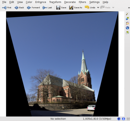
And there you go, press , and I got the following result:
|
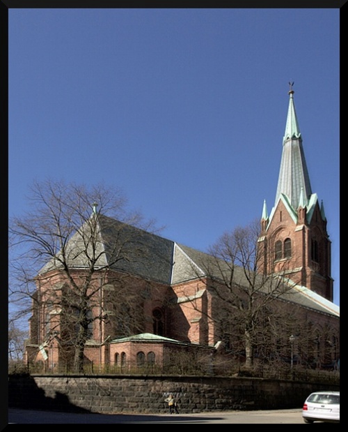
Obviously, after reshaping the image, the borders are no more square, and Showfoto has filled the missing parts with black. Now, we'll have to crop this ugly border off (take care when undistorting, because you may leave some image parts off for cropping!)
And yes, we are done. Doesn't it look more natural this way ![]()
|
Well, I hope you enjoyed this tutorial. I know... you guys that followed the tutorials so far, thought that this tutorial would end up being much harder... that's life. As far as you got a bit of taste for photos, KDE and photography is damn easy. See ya all next time! ![]()
