Showfoto/Brightness: Difference between revisions
m (to avoid the lonely ")" problem + typos) |
m (added BreadCrumbs) |
||
| (One intermediate revision by one other user not shown) | |||
| Line 1: | Line 1: | ||
<languages /> | <languages /> | ||
<translate> | <translate> | ||
{{GrafBreadCrumbs|1=Showfoto|2=Brightness}} | |||
==Photo KDE Tutorial 1-4: Brightness/Contrast/Gamma + Hue/Saturation/Lightness== <!--T:1--> | ==Photo KDE Tutorial 1-4: Brightness/Contrast/Gamma + Hue/Saturation/Lightness== <!--T:1--> | ||
Unai Garro - Summer 2008 | Unai Garro - Summer 2008 | ||
| Line 143: | Line 145: | ||
<!--T:39--> | <!--T:39--> | ||
[[Category: | [[Category:Graphics]] | ||
[[Category:Photography]] | [[Category:Photography]] | ||
[[Category:Tutorials]] | [[Category:Tutorials]] | ||
</translate> | </translate> | ||
Latest revision as of 18:26, 1 November 2020
Home » Applications » Graphics » Showfoto » Brightness
Photo KDE Tutorial 1-4: Brightness/Contrast/Gamma + Hue/Saturation/Lightness
Unai Garro - Summer 2008
I began this series of tutorials some time ago already, and all of them covered light issues. We used tools like levels, curves, or white balance adjustment.
I wanted to approach other type of issues this time, but I think light issues would be rather incomplete if I didn't address contrast, brightness and colors adjustments. Possibly you are somewhat familiar with these already, but I think they're worth covering.
Follow up:
More than just a few times, we take a photograph of a gorgeous landscape, and we dream about the cool result we will get once we are at home. Nowadays digital cameras help us previewing the result on the LCD, but usually they are not too trustworthy, so we end up seeing the real results only when we are home.
So we arrive home with our cool photograph, and we find, disgusted, that it doesn't have the colors that we expected from it. What to do? We use Showfoto or Krita again, of course!
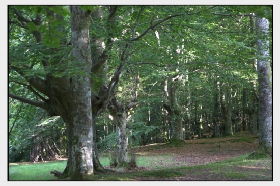
Lets see the following photograph as sample:
|
When I took this photo, my eyes were seeing all sort of strong green colors, and reddish leaves in the ground. But somehow the camera didn't capture all that contrast for me. But what's contrast? It's just the color differences found inside an image, the difference between a pixel/region and the surrounding. The more contrasty the image, the clearer it is to the eye.
This image instead, is whiteish, it's flat, it lacks contrast. Why? because it doesn't cover the whole histogram.
"Ahhhhhh..." you'll say now.... "I know this! I can fix this using ! I learned it in the first tutorial!". Yes, and that's what we will try first. Open the image in Showfoto, and adjust the levels:
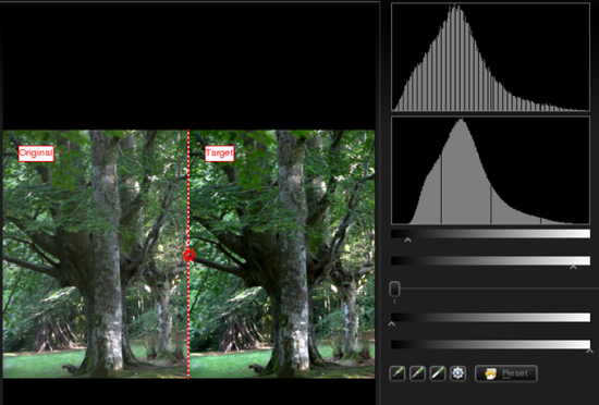
|
The result is the following image:
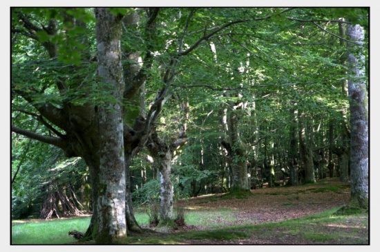
|
Not bad, is it? But still, I had a different photo in my mind. Leaves were greener, there was more contrast (like darker shadows), and the leaves on the floor were more reddish. So can we fix this? Yes, we could use the to improve shadows for example. But I will show you some new tools that can achieve similar results in this case:
In Showfoto, go to the menu :
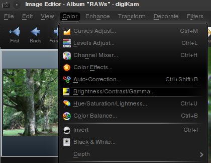
|
You will get a very easy to use dialog with the following controls:
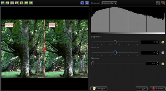
|
The first slider controls the brightness/darkness of the image. The second slider increases or reduces , and uhm... what's ? Look at the following image:
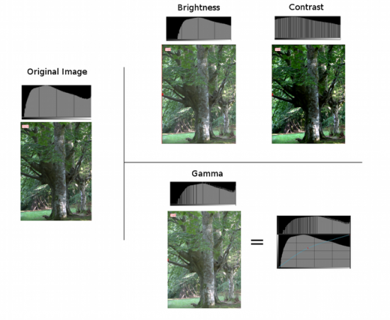
|
The photo and histogram on the left are those of the original image. In the right hand, the three photos show the result of increasing brightness, contrast, and gamma respectively. As you can see, when using the brightness control, it moves the whole histogram to the right. Shadows will disappear and become light grays. The result isn't very pleasing, as it is less contrasty. This could be fixed by adjusting contrast. In the output, you can see that the histogram has been expanded. This means that each color has been separated further from each other, and thus increase color difference (contrast). The output is much more pleasing than the original image in this case. The image is no more flat, it's much more contrasty, and shadows are clear dark contrasted.
At this point you should have noticed something important. Both contrast and brightness controls can clip the histogram and cause information loss! Now look at the gamma adjustment. I pushed even further than the first tool, and still, the image wasn't clipped. What did the gamma tool do?
The control is like adjusting the curves tool upwards in the middle (see the figure). It affects mostly to the middle gray levels. Blacks will remain black and whites will remain white. (unlike control where blacks become gray). It compresses the histogram in the right part by compressing highlights, but shadows are expanded and thus causes to extend contrast there.
Given that this tool can clip the histogram, to avoid it as much as I can, I will change the order. Instead of doing then , I will do then . It's usually best adjusting levels after all other light adjustments have been done. So I did the following adjustment to the image:
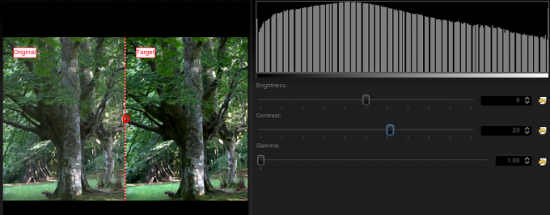
|
I could have pushed contrast even further, but I prefer natural looking photos. Then, afterwards, even if it wasn't much needed due to the clipping, I adjusted levels a bit. This is what I got:

|
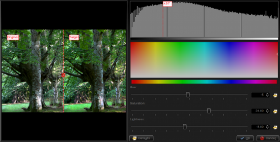
The result is similar to the previous one, but a bit more contrasty. Still, I'm missing colors here, something is missing? Of course, lets open the option from the menu:
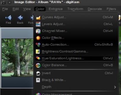
|
|
It will open a dialog where Showfoto permits adjusting the colors of the image. The control can make colors stronger or weaker. The control permits altering colors towards another one (brighter colors to darker green, or even to yellow...), and finally, can make colors brighter or darker. When the image is lightened up, it causes moving the histogram's dark part upwards and compressing the whole of it on the right, thus blacks dissappear and contrast can be reduced easily thanks to the compression.
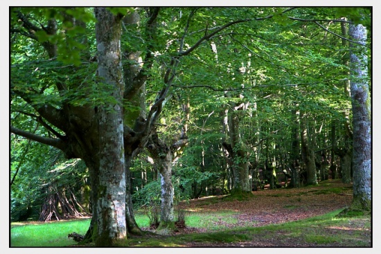
In my adjustment, I pushed saturation up to 34, reduced lightness a bit, and retouched the greens by altering the hue slightly. This is what I got finally:
|
Now yes, I'm happy with the result. That's what my eyes saw!!!!!
Thanks for reading this tutorial and I hope you found it useful. Cya on the next tutorial!
Notes:
