KWord/Manual/IntroGUI/fr: Difference between revisions
(Created page with "==Utilisation des menus==") |
(Created page with "==Utilisation des barres d'outils==") |
||
| Line 52: | Line 52: | ||
==Utilisation des menus== | ==Utilisation des menus== | ||
== | ==Utilisation des barres d'outils== | ||
==Using Dockers== | ==Using Dockers== | ||
Revision as of 17:53, 25 August 2012
Introduction à l'interface graphique de KWord
PAS DE PANIQUE !!
L'interface graphique de KWord (comme celles des autres applications de KOffice) est flexible, simple et extensible à la fois. Une telle interface illustre la volonté d'intégrer profondément les différentes applications de cette suite bureautique aussi bien que la structure modulaire dont KOffice et KWord font partie.
Les parties principales de l'interface graphique de KWord

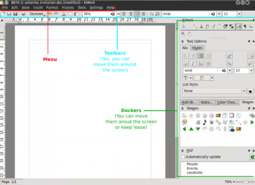
Comme nous pouvons le voir sur l'image au-dessus, les composants principaux de l'interface graphique de KWord sont les suivants :
- Menus
- Panneaux
- Barres d'outil
Menus always stay at the same place, while dockers and toolbars are dynamic pieces of the KWord GUI that can be dragged around the whole interface, float free or be grounded/grouped at any one of 4 edges of your window. This allows for building the interface which You need, not the choice of somebody who thinks he is to define what Your word processor / working style / thinking should be like.
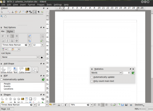
La flexibilité de l'interface graphique de Kword vous permet de définir l'apparence de celle-ci, par exemple, comme ceci :

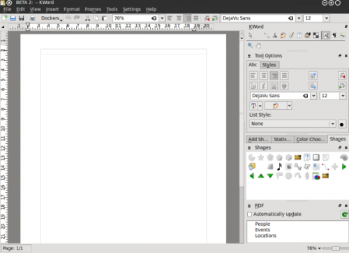
Such an interface setup allows, for example, to use KWord if you have a KDE panel popping up from the right side of your screen as your mouse approaches it. If you have set up your workspace like that sometimes your panel might be making it hard for you to get to your dockers.
Menus
Menus are Your terra firma (firm ground under Your feet) of the KWord GUI - all the applications' functions are accessible from there and menus are always visible to the user. In some cases the user may find it to be the most convenient way to use menus only (very small screen estate), but usually they are used in combination with dockers and toolbars.
Most users prefer to use dockers and toolbars as a quick visual access for the functions they use frequently and go to the menu for less used functions. For example, making text bold or italic or selecting font is in most cases more frequently used then say, the frameset properties and it makes more sense to access the latter from the menu.
Barre d'outils
Oooh, ces formidables barres d'outils de KWord ![]()
Panneaux
KWord interface, as well as the interface of any KOffice application is built around the concept of Dockers. A Docker is, essentially a KOffice GUI widget that unites certain related functions. For example, "color chooser" docker allows user to choose a color of editable object, "Add Shape" docker allows user to add different shapes (text, images, etc) to their KWord document.
Every docker allows for certain editing functionality in KWord. Since the dockers can be easily turned on and off, grouped, they allow the GUI to be set up so that only the functions the user actually uses/needs are visible in KWord GUI.

Utilisation des barres d'outils
Using Dockers
List of KWord dockers
- Toolbox
- Tool Options
- RDF
- Add shape
- Statistics
- Color chooser
- Shapes
- Scripts
- Shape properties
- Shadow properties
Governing dockers (turning on and off)
Of course, each user has different requirements of the word processing tool. Especially when the tool is that versatile as KWord is.
A nice example of that is its RDF functions. This is used, for example, to integrate someone's contacts into your document, so that when they are changed, say in your addressbook they are changed in your document. A cool feature, right? Sure, but some people do not need it at all. They are happy with typing and making letters big/small and bold/regular.
We easily came to a conclusion that not really everybody needs to have all the dockers in their KWord interface. It is always better to have some more free space for some other dockers.
Since dockers reflect the modularity of KOffice and KWord their number is constantly growing as is the number of tools and plugins which are available for KWord. And this is the very point where we understand that we need to manage them somehow. Especially if You have a not-so-new notebook with limited screen width.
So, how can You get dockers located on screen in order that is good for you?
Simple:
- Switch off the unnecessary dockers
- Switch on the needed ones (yes, those you personally need, not those someone said must be in a word processor)
- Change the screen edge to suit the way you work
- Make dockers independent
- Group them (probably the most important)
THE DOCKERS CAN BE HIDDEN BY PRESSING Ctrl + H, starting from KOffice 2.3
