User:Andrew/Typography: Difference between revisions
No edit summary |
|||
| Line 1: | Line 1: | ||
__NOTOC__ | __NOTOC__ | ||
===Typeface Styles=== | ===Typeface Styles=== | ||
The typeface styles are allocated throughout the user interface s as follows.Conduct design activities using the design typeface. Implement the design using the corresponding system typeface. | The typeface styles are allocated throughout the user interface s as follows.Conduct design activities using the design typeface. Implement the design using the corresponding system typeface. | ||
| Line 25: | Line 24: | ||
===Color and Contrast=== | ===Color and Contrast=== | ||
The text foreground and background color can be varied to provide additional hierarchical hints | The text foreground and background color can be varied to provide additional hierarchical hints. The contrast between the foreground and background color must be sufficient to preserve legibility of the text. A minimum contrast ratio of 4.5:1 (calculated based on luminance values) is recommended. Text representing disabled may have a contrast ratio as low as 3.0:1. | ||
===Words per line=== | ===Words per line=== | ||
| Line 31: | Line 30: | ||
===Exceptions=== | ===Exceptions=== | ||
When the visual design calls for an area of exceptional focus, a larger typeface size. | When the visual design calls for an area of exceptional focus, a larger typeface size may be used. For significantly larger typeface use a Lighter typeface weight. Otherwise, maintain all other typeface characteristics for the typographic category. For such exceptions to be effective, they must be rare. | ||
Revision as of 22:47, 30 June 2014
Typeface Styles
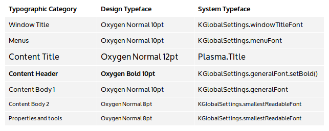
The typeface styles are allocated throughout the user interface s as follows.Conduct design activities using the design typeface. Implement the design using the corresponding system typeface.

Typeface point sizes correspond to actual typeface sizes at the default xorg 96 dpi setting, where 1 pt = 1/72 inch (0.35mm). A monospace version of the Content Body 1 typeface should be used for code content.
Typographic Category Examples
Window Title - Window Title
Menus - Menu bar, Popup menus
Content - Selection panel, Content Panel, Information Panel
Content Title - Category title, Panel popups title
Content Header - Section headers
Content Body 1 - Text content, Icon grid items, List items
Content Body 2 - Captions , tooltips
Properties and Tools - Property panel, Toolbar, Status bar
Color and Contrast
The text foreground and background color can be varied to provide additional hierarchical hints. The contrast between the foreground and background color must be sufficient to preserve legibility of the text. A minimum contrast ratio of 4.5:1 (calculated based on luminance values) is recommended. Text representing disabled may have a contrast ratio as low as 3.0:1.
Words per line
Limit line length to between eight to ten words per line. For typographic categories that use an all caps typeface, limit to between three and four words per line.
Exceptions
When the visual design calls for an area of exceptional focus, a larger typeface size may be used. For significantly larger typeface use a Lighter typeface weight. Otherwise, maintain all other typeface characteristics for the typographic category. For such exceptions to be effective, they must be rare.
