User:Annew: Difference between revisions
mNo edit summary |
mNo edit summary |
||
| Line 13: | Line 13: | ||
{|style="width:75%" cellpadding="4" | {|style="width:75%" cellpadding="4" | ||
|<imagemap> | |<imagemap> | ||
Image: | Image:Kword.png|48px | ||
default [[KWord]] | default [[KWord]] | ||
desc none | desc none | ||
| Line 50: | Line 50: | ||
---- | ---- | ||
=First Layout Project= | |||
{{Template:I18n/Language Navigation Bar|KWord/Layout2}} | |||
{| | |||
|[[Image:KWordLayoutTut2.png|thumb|265px|A First Layout Project]]|| In our second Layout Tutorial you will use your own pictures and text | |||
|} | |||
In this lesson you will revise the steps of the first tutorial: | |||
::* add text boxes and adjust their size and position | |||
::* format text | |||
::* add illustrations | |||
::* adjust their size and position | |||
You will create a page suitable for use in a photo album, using text flow between frames. | |||
Before you start you may find it helpful to create a temporary folder containing all the pictures you intend to use. For the purpose of this tutorial you should scale your pictures to no more than 125mm (5in) wide as inserting large images has an impact on printing time. | |||
As in our first layout project, select the blank page template and adjust your margins. Plenty of white space is advisable in a photo album page, but if your margins are too large you will find that either the pictures or text suffer from lack of space. | |||
Revision as of 16:41, 31 May 2009
Saved for re-use: Template:I18n/Language Navigation Bar
 |
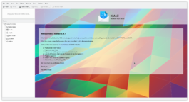
KMail is the email component of Kontact, the integrated personal information manager of KDE. |
Image map:
KWord
|
kwrite ftp://ftp.kde.org/pub/kde/Welcome.msg |
First Layout Project
Template:I18n/Language Navigation Bar
 |
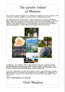
In our second Layout Tutorial you will use your own pictures and text |
In this lesson you will revise the steps of the first tutorial:
- add text boxes and adjust their size and position
- format text
- add illustrations
- adjust their size and position
You will create a page suitable for use in a photo album, using text flow between frames.
Before you start you may find it helpful to create a temporary folder containing all the pictures you intend to use. For the purpose of this tutorial you should scale your pictures to no more than 125mm (5in) wide as inserting large images has an impact on printing time.
As in our first layout project, select the blank page template and adjust your margins. Plenty of white space is advisable in a photo album page, but if your margins are too large you will find that either the pictures or text suffer from lack of space.


