Showfoto/Perspective/it: Difference between revisions
Created page with "Utilizzerò la foto seguente come esempio per descrivere il problema:" |
Created page with "Category:Casa e svago/it Category:Fotografia/it Category:Guide/it" |
||
| Line 75: | Line 75: | ||
Well, I hope you enjoyed this tutorial. I know... you guys that followed the tutorials so far, thought that this tutorial would end up being much harder... that's life. As far as you got a bit of taste for photos, KDE and photography is damn easy. See ya all next time! [[Image:Icon wink.gif]] | Well, I hope you enjoyed this tutorial. I know... you guys that followed the tutorials so far, thought that this tutorial would end up being much harder... that's life. As far as you got a bit of taste for photos, KDE and photography is damn easy. See ya all next time! [[Image:Icon wink.gif]] | ||
[[Category: | [[Category:Casa e svago/it]] | ||
[[Category: | [[Category:Fotografia/it]] | ||
[[Category: | [[Category:Guide/it]] | ||
Revision as of 18:07, 31 October 2010
Guida fotografica KDE 1-5: Sistemare la prospettiva
Unai Garro, estate 2009
Di nuovo ciao. Sì, per quelli che credevano che ero scomparso, mi spiace, sono vivo ![]() . Non avendo avuto una connessione internet per mesi e con il lavoro aggiuntivo avuto per un po', non potuto pubblicare qualsiasi tipo di guida, ma ora eccoci di nuovo qui.
. Non avendo avuto una connessione internet per mesi e con il lavoro aggiuntivo avuto per un po', non potuto pubblicare qualsiasi tipo di guida, ma ora eccoci di nuovo qui.
Per quelli nuovi a queste guide, l'obiettivo è mostrare come utilizzare correttamente le esistenti applicazioni open source di KDE per migliorare le tue già ottime foto ed essere orgoglioso di mostrarle. Con l'ultima guida abbiamo già trattato gran parte degli strumenti per migliorare l'illuminazione in una foto come le curve, i livelli, gli strumenti luminosità/contrasto e gamma, ecc.
In questa guida l'obiettivo è qualcosa che la maggior parte di noi dimentica completamente a meno di non prestare attenzione a una foto. Qualcosa che può essere fastidioso quanto facile da risolvere: la distorsione prospettica. Sì, credimi, questa guida sarà molto più facile da seguire della precedente.
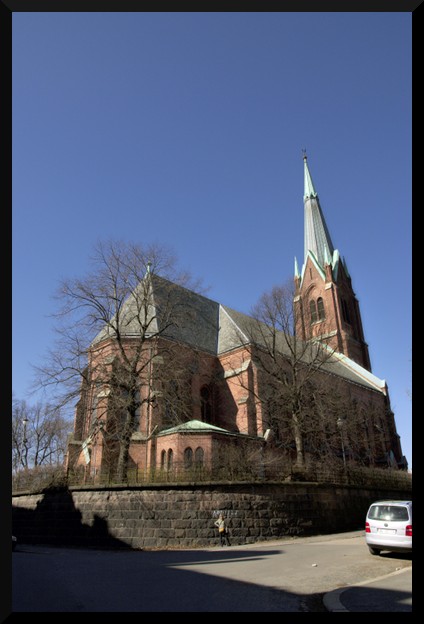
Utilizzerò la foto seguente come esempio per descrivere il problema:
|
At first sight, you may say it looks okay... but pay a bit more attention... doesn't it look like the building is bent? as if the walls are not straight upwards? Yes, that's what I was referring to. It may look natural in a photo, since we got used to it, but... the building actually doesn't look like that!
Follow up:
So who's faulty here? Some will claim that the lens in the camera was crap. Well, I'd say the photographer was crap, instead (that was me) ![]()
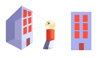
The problem isn't the camera and neither is it the lens. This effect is pretty obvious if you think what happens when you approach a building and look at it with a camera:
|
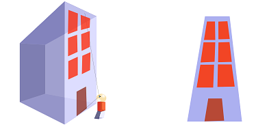
It looks correct right? Now lets approach the building more, look at it from the bottom part rather than front, and lets make the building much larger than us:
|
The further the building parts are, the smaller they look. So the top part looks smaller than the bottom part.
That's exactly what happens in our original photo too. In that photo, I was very close to the building, at the bottom of it. It may not look like that, but that's because I was using a wideangle lens.. Then, the closer you are to the building, and the larger being it, the more pronounced the effect is.
What would you have to do? Well, if at all possible, try avoiding this effect when taking the photograph. Position yourself further away from the building when taking the pic, and try looking perpendicular to the building, not looking up.
If everything fails, ... tadaaaah! yes, Showfoto comes to the rescue here!
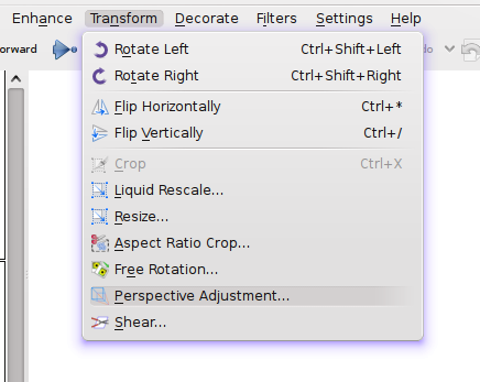
Let's open the picture in Showfoto, and look in the menu for
|
Once selected, you should see a dialog similar to the following:
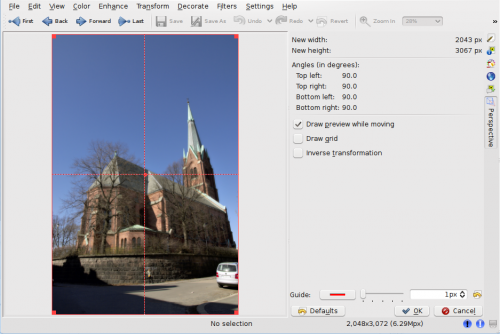
|
In this dialog, you can move around the corners and stretch the picture in any shape you want (it applies a transformation matrix). You can use the dotted guide in the picture to make sure that the parts you want straight are vertical or horizontal. In this photo, I took building walls and trees as reference, and tried straightening them:
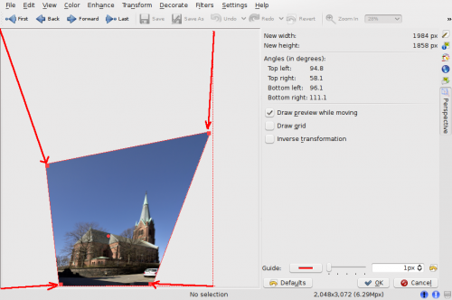
|
And there you go, press , and I got the following result:
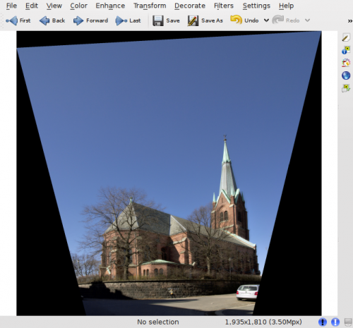
|
Obviously, after reshaping the image, the borders are no more square, and Showfoto has filled the missing parts with black. Now, we'll have to crop this ugly border off (take care when undistorting, because you may leave some image parts off for cropping!)
And yes, we are done. Doesn't it look more natural this way ![]()
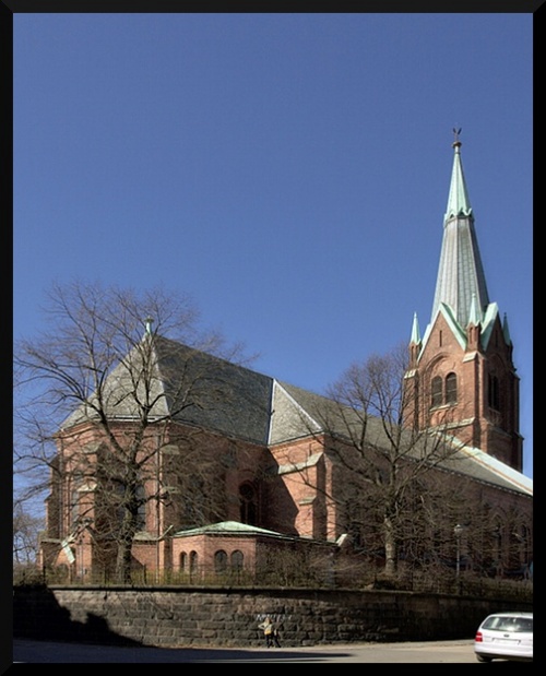
|
Well, I hope you enjoyed this tutorial. I know... you guys that followed the tutorials so far, thought that this tutorial would end up being much harder... that's life. As far as you got a bit of taste for photos, KDE and photography is damn easy. See ya all next time! ![]()
