Showfoto/White Balance/ca: Difference between revisions
Created page with "==Guia d'aprenentatge de fotos al KDE 1-3: Balanç de blancs== ''Unai Garro (uga): estiu de 2008''" |
Created page with "Category:Llar i aficions/ca Category:Fotografia/ca Category:Guies d'aprenentatge/ca" |
||
| Line 146: | Line 146: | ||
Another nice photo and tool for our collection - thanks Mike and Paul for this great image and I really hope you enjoy these series. Feel free to give suggestions for improvements and cya in the next tutorial! | Another nice photo and tool for our collection - thanks Mike and Paul for this great image and I really hope you enjoy these series. Feel free to give suggestions for improvements and cya in the next tutorial! | ||
[[Category: | [[Category:Llar i aficions/ca]] | ||
[[Category: | [[Category:Fotografia/ca]] | ||
[[Category: | [[Category:Guies d'aprenentatge/ca]] | ||
Latest revision as of 15:58, 18 April 2012
Guia d'aprenentatge de fotos al KDE 1-3: Balanç de blancs
Unai Garro (uga): estiu de 2008
This is the 3rd tutorial in this series, trying to show how effective KDE photography applications can be for fixing and/or improving your photographs overall. In the first and second tutorials we addressed light exposure issues, i.e., we addressed photos that had regions gone too dark or too bright, and we showed how to fix them using either the levels tool or the curves tool.
In this third part we will continue addressing the light issues, but we will target color issues rather than brightness issues.
So lets begin!
Most of the times we use our cameras outdoors. Light is nice, sun shines, and we get nice pictures out of our cameras. But sometimes we need to take pictures indoors, in parties or conferences, and light conditions aren't the best. We even take pictures with flash, sometimes. So "What's the problem?", you will ask. Well, many times when taking photos the effect goes unnoticed, but indoor lights are either tungsten lights (yellowish or orangeish) or fluorescent lights (more bluish), and depending on the light conditions, the photo results vary a lot.
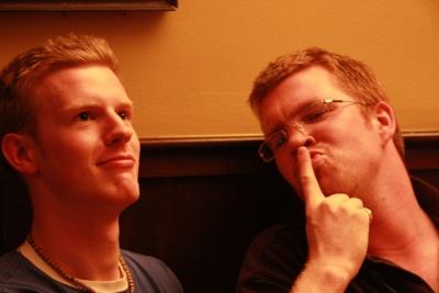
Lets see the following example, from Akademy 2008 pictures, kindly donated by Sebastian Kügler for this tutorial:
|
Yes, it's Mike and Paul, while discussing backwards compatibility issues of core kdelibs changes, in a serious Akademy meeting!
Uh, isn't Mike's face a bit reddish? does he actually look like this? is it due to the heated discussion they are having? ... oh wait... no, that's just poor lighting!
So what happened to that photo? Simply, the room was poorly illuminated by yellowish tungsten lamps, and the camera captured that nicely. Our eyes (or rather, our brain), compensate it automatically to identify the colors, but cameras not always manage doing that.
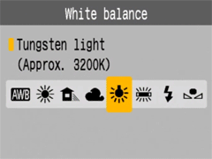
Most or all digital cameras these days allow correcting that when taking the picture, with an option called "white balance (WB) setting". The menu is usually similar to the following image:
|
If the camera was set like in this picture (light bulb/tungsten light selected), the picture would have turned out better colored. In the same camera menu, you will find many more options for cloudy/sunny days, fluorescent light, flash light, etc. Please refer to your own camera's manual for more details, since each particular camera is different.
By default, though, cameras are usually preset to . This means that the camera will try guessing which setting of all is the most adequate in each case. It can work nicely, but honestly, most of the times they fail while indoors, like in this case.
So what to do now? Showfoto to the rescue again!!!!!!
Lets open the photo in Showfoto, and select the option in the menu:

|
You will get the following dialog popping up:

|
It sounds complex, right? Well, it's very simple. The most important parts are the top two ones.
Both tools do exactly the same, but the input is a bit different in each case.
The second tool is what you already know. It's equivalent to the camera's . There are different presets for each light types: 40watt lamps, 100 watt lamps... You can select one of them, and it should fix the colors, but... which of them is the correct one for our light source? hard choice, huh?
The first tool is much more flexible. It allows adjusting the Kelvin Temperature of the light. The Kelvin temperature indicates just if the light source was warmer (reddish), or colder (bluish). The more you move the slider to the right, the orange/redder the image will become. The more you move it to the left, the more blueish it will turn. But this tool can be a bit hard to tweak, and usually requires extra hard work like adjusting the green color slider. Not very easy to do.
So what's the solution? It's easy. In the same dialog, right besides the Kelvin temperature setting, you will find a color picker as shown in the next picture. The color picker allows us selecting a point in the original image that should have been white or gray (i.e., not colored, same R=G=B values).
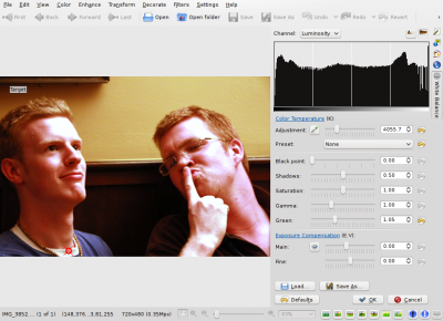
Most pictures have such places. For example, Mike's t-shirt is possibly white around his neck, given the photograph. So I clicked on it:
|
Impressive, isn't it? Yes, that's the power of white balance correction. Now you really get to see the real colors in the photograph. You can now know that his face isn't orange, the wall was actually painted yellow, and his t-shirt was dark blue. You can adjust further the tool manually by adjusting the Kelvin temperature, brightness of the picture etc. (for length reasons, I will leave the exploring of those tools to the reader).
I could just be satisfied with this photo and be done with the tutorial, but I am not. Look at Mike's forehead, the tool has overexposed it and it's all white now. There's no information there, we clipped the histogram. Somehow, for reasons unknown to me, Showfoto's white balance tool has a tendency to do this in some photos where highlights exist and have little detail. And no matter how much you tweak the tool you may not get it right, like in this case. But I won't give up.
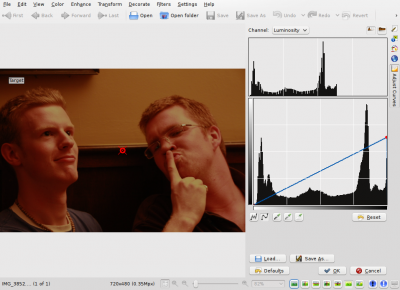
If you remember from the second tutorial, we learned how to adjust the brightness of the image using curves. Lets do it then. BEFORE applying the white balance tool, lets darken a bit Mike's forehead:
|
And now yes, after repeating the same process, I got the forehead not that
much overexposed:
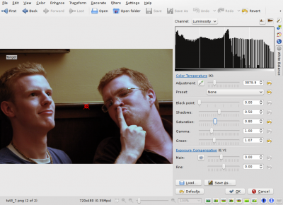
|
In the same tool, I adjusted saturation a bit lower since the shadows were still a bit reddish, and yes. Now just press .
Before presenting the image, adjust a bit levels (as shown before in the first tutorial) and we are now done:
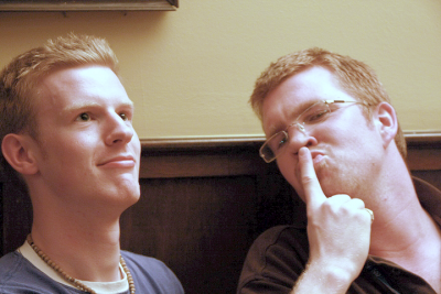
|
Another nice photo and tool for our collection - thanks Mike and Paul for this great image and I really hope you enjoy these series. Feel free to give suggestions for improvements and cya in the next tutorial!

