LabPlot/2DPlotting/BoxPlot: Difference between revisions
| Line 39: | Line 39: | ||
== Variable width box plot == | == Variable width box plot == | ||
We can draw attention to the difference in size of the data sets by using '''variable width box plots'''. The width of each box plot can be made proportional to the square root of the number of points (n) contained in each data set as shown in the example below. | |||
[[File:Labplot boxplot var width.png|300px|thumb|center]] | |||
== Notched box plot == | == Notched box plot == | ||
Revision as of 14:50, 20 June 2021
Basic Concepts
A box plot (also known as a box-and-whisker plot) provides a quick visual summary of four important aspects of a distribution of values contained in a data set:
- Level - What is the central value of the data set?
- Spread - How much dispersed are the values?
- Shape - Is the data set symmetric or skewed?
- Outliers - Are there any unusual values?
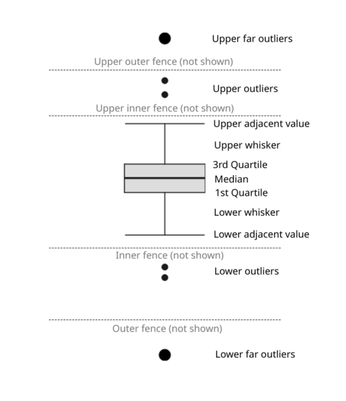
Elements of a box plot:

- Box - the upper and the lower lines of the box correspond to the third (Q3) and the first (Q1) quartiles respectively. The difference between the Q3 and the Q1 is called the interquartile range (IQR). The height of the box represents the IQR.
- Median line - the line dividing the box into two parts and representing the median value of the data set.
- Inner fences (not shown by default) - the upper inner fence represents the value that is 1.5 times the IQR above the Q3 and the lower inner fence represents the value that is 1.5 times the IQR below the Q1.
- Outer fences (not shown by default) - the upper outer fence represents the value that is 3 times the IQR above the Q3 and the lower outer fence represents the value that is 3 times the IQR below the Q1.
- Adjacent values - these are the outermost values on each end that are still within the corresponding inner fence.
- Caps - the lines referring to upper and lower adjacent values.
- Whiskers - the lines extending to caps, i.e. they lead from Q3 and Q1 to upper and lower adjacent values respectively.
Note that there are also other ways to define whiskers in LabPlot, namely: min/max, mean +/- 1 standard deviation, mean +/- 3 standard deviations, median +/- 1 median absolute deviation, median +/- 3 median absolute deviation, 10/90 percentiles, 5/95 percentiles and 1/99 percentiles.
Outliers
With these definitions at hand we can use a rule of thumb to attempt to identify and plot potential outliers:
- Outliers - the values lying beyond either inner fence and depicted by small black circles (or other symbols).
- Far outliers - the values lying beyond either outer fence and depicted by large black circles (or other symbols).
Note that the rule of thumb for outliers is just a handy guideline that doesn't necessarily substitute any knowledge and good judgment.
Jittering
Box plots are most useful for emphasizing summary statistics but convey no information about whether there are, for example, multiple peaks, gaps or clusters in the distribution. To overcome their misleading potential, all data points can be added on top of boxes, using jittering (adding random noise over the data points) to avoid overplotting.
TODO: use the data sets presented on https://www.autodesk.com/research/publications/same-stats-different-graphs having completely different distribution but leading to the same box plot visualizations and show how jittering can provide more insights.
Note: instead of (or in addition to) jittering, a combined visualization of histogram and box plot can be used. TODO: produce an example similar to Darek's visualization.
Variable width box plot
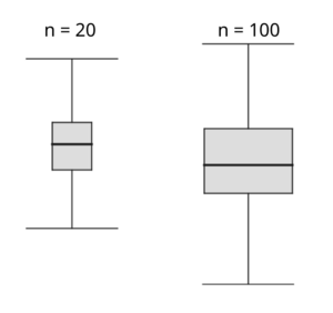
We can draw attention to the difference in size of the data sets by using variable width box plots. The width of each box plot can be made proportional to the square root of the number of points (n) contained in each data set as shown in the example below.

Notched box plot
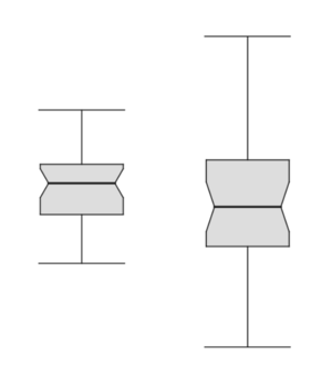
Box plots, laid out side by side, allow visual comparison between different batches of data in four aspects regarding level, spread, shape and potential outliers. The notches on the sides of box plots permit a more refined comparison by providing a rough measure of the significance of differences between medians. They define a confidence interval around the median that has been adjusted to make it appropriate for comparisons of two boxes. More specifically, if the notches of two boxes do not overlap, we can be confident at roughly the 95% level (this is "strong evidence") that the two medians are different.
The height of the notch is the median +/- 1.58 x IQR/sqrt(n) where n is the number of data points.

In the example above, there is no strong evidence for the difference between two medians because the notches overlap.
Be careful not to interpret the notches as defining a confidence interval of the median. They refer to a 95% confidence interval for the difference in the medians. This is an individual 95% level—that is, no allowance is made for the number of comparisons considered.
References
- Marsh, C. (1998). Exploring Data. An Introduction to Data Analysis for Social Scientists. Polity Press.
- Tukey, J. W. (1977). Exploratory Data Analysis. Addison-Wesley.
- McGill, R., Tukey, J. W. and Larsen, W. A. (1978). Variations of box plots. The American Statistician, 32, 12–16.
- Velleman, P. F. and Hoaglin, D. C. (1981). Applications, Basics and Computing of Exploratory Data Analysis. Duxbury Press.
