Showfoto/Levels Adjust/it: Difference between revisions
Created page with '{{Note_(it)|L'immagine originale utilizzata in questa guida [http://userbase.kde.org/File:Levels_adjust.JPG può essere trovata qui].}}' |
Created page with 'Questo è probabilmente uno dei metodi più utilizzati e più semplici per sistemare un'immagine. È così semplice ed efficace che vorrai utilizzarlo su tutte le tue immagini d'...' |
||
| Line 5: | Line 5: | ||
{{Note_(it)|L'immagine originale utilizzata in questa guida [http://userbase.kde.org/File:Levels_adjust.JPG può essere trovata qui].}} | {{Note_(it)|L'immagine originale utilizzata in questa guida [http://userbase.kde.org/File:Levels_adjust.JPG può essere trovata qui].}} | ||
Questo è probabilmente uno dei metodi più utilizzati e più semplici per sistemare un'immagine. È così semplice ed efficace che vorrai utilizzarlo su tutte le tue immagini d'ora in poi, dunque guarda e divertiti. | |||
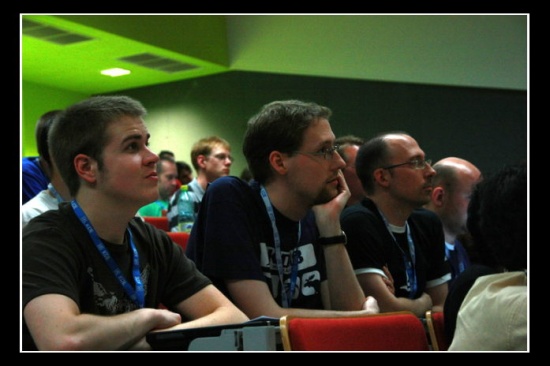
Lets see this sample photo from Akademy 2008, kindly donated by Sebastian Kügler: | Lets see this sample photo from Akademy 2008, kindly donated by Sebastian Kügler: | ||
Revision as of 09:32, 19 September 2010
Guida fotografica KDE 1-1: Regolare i Livelli
Unai Garro (uga) - estate 2008
Questo è probabilmente uno dei metodi più utilizzati e più semplici per sistemare un'immagine. È così semplice ed efficace che vorrai utilizzarlo su tutte le tue immagini d'ora in poi, dunque guarda e divertiti.
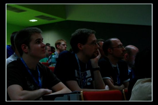
Lets see this sample photo from Akademy 2008, kindly donated by Sebastian Kügler:
|
You'll clearly see, the photo is darkish. After all, it was taken during a presentation and possibly the room was pretty dark. But that's no excuse for a bad photo ![]()
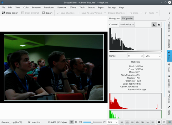
Why is it dark? Lets open the photo in Showfoto (Digikam's editor) and see what's going on:
|
On the top right, you can see the image's histogram. (I have pushed the histogram button to see it more clearly). So "What's the histogram?", you'll, ask. The histogram is just a pixel count. It counts how many pixels there are for each gray level, and shows them in a graph. The left part of the histogram are dark/black colors, and the right part of the histogram are brightest colors.
You can see that our image has the histogram concentrated on the left part. Thus, it's mostly black. The right part of the histogram isn't used at all, as shown in the figure. Why did this happen? Just because the camera failed exposing the image properly, or was inappropriately configured.
If a photo is visually pleasing, usually (not always), it covers most of the histogram, from black, to white.
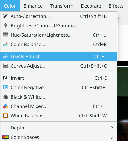
So, is there a way to fix this, then? Of course there is, and it's a very easy one. Select the menu :
|
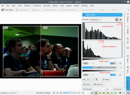
You will see a new popup showing a tool to adjust the histogram output. There are several parts in it. On the top right, there are two histograms. The first one is the output/new histogram, and the second (bottom) one is the input/original histogram.
|
As you can see, I have adjusted the output histogram to cover it all, see? So how have I done this? Very simple:
There are 4 sliders in this tool. The first two sliders mark the beginning and end of the part of the histogram that I am interested in. I have moved them to match the full histogram of our original image.
The other two sliders mark the range of the histogram we want as output. We want the histogram to cover from black to white, so just move the sliders to the left corner and to the right corner.
Press , et voilà, your nice photo is fixed. Congrats ![]()
|

![40px]](/images.userbase/c/c1/Note-box-icon.png)