Rekonq: Difference between revisions
No edit summary |
(Correct typo, slightly separate images for clarity) |
||
| Line 27: | Line 27: | ||
Click on any of these for an enlarged screenshot: | Click on any of these for an enlarged screenshot: | ||
{| | {|cellpadding="4" | ||
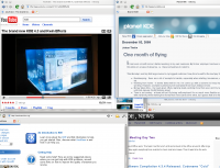
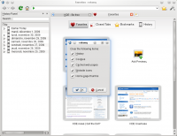
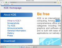
|[[Image:Rekonq1.png|200px|thumb|Multiple windows | |[[Image:Rekonq1.png|200px|thumb|Multiple windows and youtube]]||[[Image:Rekonq-0.3-3.png|200px|thumb|History panel and "clear private data"]]||[[Image:Rekonq-0.3-4.png|200px|thumb|Integral page zoom, findbar and private browsing enabled]] | ||
|} | |} | ||
Revision as of 16:11, 2 December 2009
Template:I18n/Language Navigation Bar
 |
The fast, simple, WebKit-based browser |
Looks very different from Konqueror? Yes, it does, and that is going to please a lot of people. So what is different?
- It's a new application, not built on legacy code
- It uses WebKit, giving access to a whole new set of features and tools, which will allow further development.
- It's simple : no menubar, only one menu with the most important actions
Let's look at its features - does it have the ones you loved in Konqueror? Well, it's still early days, but so far it can boast
- A clean, uncluttered look
- Has only one bar for searches and urls
- Support for kde web shortcuts
- Tabbed and multi-window browsing
- Shares your Konqueror bookmarks
- Shares your Konqueror cookies
- Renders many pages that Konqueror struggles with
- Can navigate in a proxied network
- Has a private browsing mode
- Can inspect web pages.
- Has a homepage with previews of your preferred sites
Click on any of these for an enlarged screenshot:
 |
 |
 |
You'll find these and other screenshots on Picasa. The project's home page is here.
The developers can be found on the IRC channel #rekonq and there is a mailing list for your questions.
Take a quick tour with this mini-overview, then sit back and enjoy the experience.
