LabPlot/GettingStarted/YourFirstDataImportVisualisation
Import of the data and its visualization can be achieved with a couple of mouse clicks in LabPlot:
Create a new project
Create a new project by selecting "File/New" from the main menu:

Here and in the similar steps below, the action can also be triggered alternatively from the corresponding icon in the toolbar or from the context menu, if available.
After the new project is created, you'll see Project Explorer showing the structure of the project as well as Properties Explorer showing the properties of the currently selected object in the project explorer. The project is still empty and we're going to add some more content to it now.
Create a new spreadsheet
The data in LabPlot is organized and stored in Data Containers. In this particular example, we're dealing with data organized in columns (one column per variable). Spreadsheet is the appropriate data container to import such data into. To create a new spreadsheet, choose "Add New/Spreadsheet" from the context menu in the Project Explorer:

A new spreadsheet will be created with the default settings:
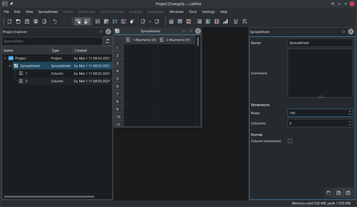
Now we are ready to import the data into this new spreadsheet.
Import data
To import the data from a file, choose "Import/Import from File" from the main menu:
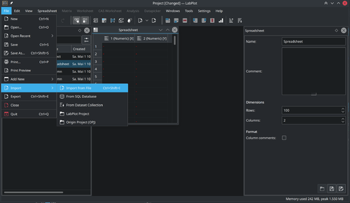
In the "Import Data" dialog box which will appear, specify the location of the file to be imported and other relevant settings (e.g. the separating characters):
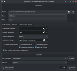
Navigate to the "Preview" tab in this dialog box to check whether the structure of the data will be properly read with the current settings:
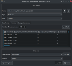
Click on the "OK" button to import the data into the spreadsheet. After the import, you'll see your data in the spreadsheet:
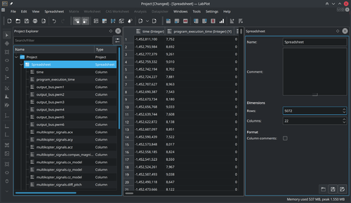
Visualize data
The imported data contains signals from multiple sensors that were placed on a multicopter. We want to visualize the acceleration in the x-direction. For this we select the column containing the data we want to plot and choose "Plot Data/xy-curve" from the context menu of this column:

The "Plot Spreadsheet Data" dialog box will appear:
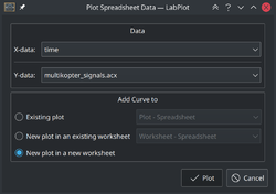
LabPlot automatically assigned the "Time" column to the X-axis. We keep all the other setting as shown in the screenshot below in order to visualize the data in a new plot on a new Worksheet:

Once the plot is created, you can change its appearance by clicking on the plot or on one of its identifiable parts and then modifying their properties in the Properties Explorer.
Export results
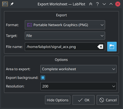
To export the plot as an image, from the main menu choose "Export" and specify the location of the file and other relevant settings:
