Projects/Usability/HIG/Layout/Image
Purpose
Imagery conveys meaning and emotion where ever used. The purpose of these guidelines is to ensure imagery is used in a consistent way to take full advantage of the meaning imagery can convey.
Guidelines
- Ensure images have the appropriate resolution for their containers. Try to not scale images up beyond their native resolution - the result will be fuzzy or pixelated.
- Don't be afraid of larger image sizes. Images are most effective when they can be seen. Tiny images lose much of their meaning (unless they are specifically crafted for small sizes).
- For example, consider a 256x256px contact photo (left) instead of a tiny 64x64px image (right). People recognize faces faster than names.
- Instead of a tiny music album cover tucked to the side, consider using a much larger size and make the album art a central part of the music experience.
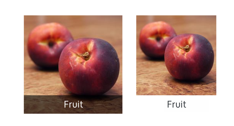
- Captions can be placed on the image instead of outside of the image allowing the image bigger and the content more immersive.
- Use a semi-transparent background behind the text to preserve contrast for legibility.


