Prova
This page is only for testing page translation feature.
Documentació
La funció de traducció de la pàgina us permet controlar la traducció de pàgines wiki en altres idiomes. En altres paraules, el contingut de cada traducció ha de ser aproximadament igual a la pàgina d'origen. La pàgina d'origen es divideix en seccions o paràgrafs, cadascun dels quals es tradueix de forma individual. Tan mateix, els canvis es segueixen en el nivell de paràgraf. Aquests paràgrafs es converteixen utilitzant Special:Translate, doncs proporciona característiques comunes conegudes de la traducció de missatges: presenta les traduccions en altres idiomes, documenta el missatge. Aquesta pàgina també és accessible des de Special:PageTranslation o Special:LanguageStats. Una nova característica actualment única per a la traducció de pàgines és el mostrar les diferències del que ha canviat als missatges.
A translation page is constructed automatically form translated paragraphs, using the source page as model. Each translation page is assigned a completion percentage, which is calculated from the translated paragraphs, and decreased if those translations are out of date. Outdated translations are also highlighted.
Something else
A cat walks.
Images in paragraphs
I want to investigate how images can be places in the middle of paragraphs without causing the imfamous shortening of the first line after the image:

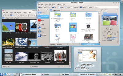
Here we just have the image code between two lines of text with no blank lines in between. This should keep the whole paragraph in one translation unit but look exceedingly ugly! The code for this image was [[Image:Kde440-desktop.jpg|400px|center]].
It doesn't look ugly, though. Can anyone explain why? Perhaps it has to do with the options used.

This time I used the 'thumb' option. How does that look? Is the line shortened now? Yes it is, so it would appear, that the problem is caused by the 'thumb' option. The code for this image was [[Image:Kde440-desktop.jpg|thumb|400px]].
I'll just make one more paragraph to see what happens if no options at all are given (other than size):
 This doesn't look right, either. Even if the image is wide enough to fill the whole line (and so avoid text aligned with the bottom of the image) there is still the problem with to little vertical spacing between text and image. The code for this image was [[Image:Kde440-desktop.jpg|400px]].
Can we conclude, that future guidlines for writers should specify, that images appearing in between text sections should never have the 'thumb' option selected? It seems that this would be a good idea. It also seems, that if the image appears in the middle of a paragraph it should have the 'center' option selected.
Smileys
The standard smiley image is too large. It pushes lines apart, which doesn't look good. It should be made smaller. I'll try to find the proper size ![]() . This it how it looks when nothing is done. On my display it is far too big. If I specify a size of 11px, this is how it looks:
. This it how it looks when nothing is done. On my display it is far too big. If I specify a size of 11px, this is how it looks: ![]() . Much better, now the size of the smiley is about the same as a capital letter (it would look even better if it could be lowered 1 or 2px). It could be larger without pushing lines apart - here is a 15px sized smiley
. Much better, now the size of the smiley is about the same as a capital letter (it would look even better if it could be lowered 1 or 2px). It could be larger without pushing lines apart - here is a 15px sized smiley ![]() (actually I believe this line has been lowered just a bit, but maybe not too much?
(actually I believe this line has been lowered just a bit, but maybe not too much?
Of course it would be better to use a template so that writers would not need to worry about these details ![]() . The template Template:Smiley is just a simple code snippet. Perhaps it can be expanded to allow for different browser settings of font size, if that information could be captured inside a template.
. The template Template:Smiley is just a simple code snippet. Perhaps it can be expanded to allow for different browser settings of font size, if that information could be captured inside a template.
Splitting bulleted lists in two translation units
- first
- second
- third
- fourth
Apparently it is possible to split a bulleted list in two translation units.
