User:Annew
I'm annew - aka Anne Wilson. I'm from Yorkshire, in the north of England, and I spend waayyyy too much time working on KDE :-) My interest has long been on user support, so this wiki is the natural extension of that.
Apart from providing support to all family members for their computing problems, I'm interested in gardening, sewing and embroidery, music and reading. In truth, though, little time goes on any of those except reading, these days.
Saved for re-use: Template:I18n/Language Navigation Bar
 |
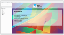
KMail is the email component of Kontact, the integrated personal information manager of KDE. |
Image map:
Error: Image is invalid or non-existent. |
KWord
|
kwrite ftp://ftp.kde.org/pub/kde/Welcome.msg |
KWord Tutorial - First Layout Project
Saved for re-use: Template:I18n/Language Navigation Bar
 |
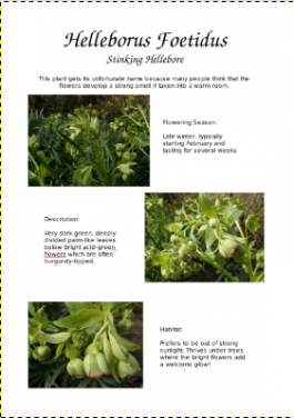
This layout was produced for use in a charity plant sale. Learn the techniques and you can use them for many purposes. You can save and reuse these images for practice. |
Launch KWord and select the Blank Document template. You will be presented with an empty page, with the size most likely for your region - usually A4 or Letter. Using the Format Menu, select Page Layout. For this project I am using A4, but it shouldn't take much adjustment to fit it to a Letter page.
For this kind of layout you need fairly generous margins, so set the top to 25mm and the other three sides to 20mm. If you work in Imperial, make them 1" at the top and 3/4" on the other sides.
In the right-hand toolbox, under Add Shape, click on Text and draw a box margin to margin and 3cm (about 1.25") high - you can see your cursor position on the ruler at the left. The result will be a coloured box, but that is just a marker. You get a Frameset dialog. This is going to be our banner heading, so you can change its name if yoiu wish, but you won't need to change anything else. Click and the text box fills with sample text. Now Click on the 'T' text editing tool - the sample text disappears and you can add your heading. I used URW Chancery L, 48pt for the title and 24pt for the subheading. Highlight both lines of text and click on ![]() to centre it. Create another text box, margin to margin, and 1.5cm deep, and add the sub-text:
to centre it. Create another text box, margin to margin, and 1.5cm deep, and add the sub-text:
|
This plant gets its unfortunate name because many people think that the flowers develop a strong smell if taken into a warm room |
That's the heading all sorted. Now we need to look at illustrating our page. Many camers use a 4:3 format, so we will use Image frames that are 8cm x 6 cm.
| [[Image:Hellebore1.jpg|thumb|100px | Create your first box touching the left-hand margin, just below your text box. Drag it as close as you can to the desired size - it can be tweaked later. Like the text box it creates a coloured box, then it opens a dialog for you to point it to the desired picture. We will select Hellebore1.jpg for this picture. |


