Test
This page is only for testing page translation feature.
Documentation
Page translation feature allows controlled translation of wiki pages into other languages. In other words the content of each translation should be about equal to the source page. The source page is split into sections or paragraphs, each of which are translated individually. Also changes are tracked in the paragraph level. These paragraphs are translated using Special:Translate, which provides the common features known from message translation: display of translations in other languages, message documentation. This page is also accessible from Special:PageTranslation or Special:LanguageStats. A new feature currently unique to the page translation is a difference display of changed messages.
A translation page is constructed automatically form translated paragraphs, using the source page as model. Each translation page is assigned a completion percentage, which is calculated from the translated paragraphs, and decreased if those translations are out of date. Outdated translations are also highlighted.
Something else
A cat walks.
Images in paragraphs
I want to investigate how images can be places in the middle of paragraphs without causing the imfamous shortening of the first line after the image:

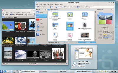
Here we just have the image code between two lines of text with no blank lines in between. This should keep the whole paragraph in one translation unit but look exceedingly ugly! The code for this image was [[Image:Kde440-desktop.jpg|400px|center]].
It doesn't look ugly, though. Can anyone explain why? Perhaps it has to do with the options used.

This time I used the 'thumb' option. How does that look? Is the line shortened now? Yes it is, so it would appear, that the problem is caused by the 'thumb' option. The code for this image was [[Image:Kde440-desktop.jpg|thumb|400px]].
I'll just make one more paragraph to see what happens if no options at all are given (other than size):
 This doesn't look right, either. Even if the image is wide enough to fill the whole line (and so avoid text aligned with the bottom of the image) there is still the problem with to little vertical spacing between text and image. The code for this image was [[Image:Kde440-desktop.jpg|400px]].
Can we conclude, that future guidlines for writers should specify, that images appearing in between text sections should never have the 'thumb' option selected? It seems that this would be a good idea. It also seems, that if the image appears in the middle of a paragraph it should have the 'center' option selected.
