User:Annew
Saved for re-use: Template:I18n/Language Navigation Bar
 |
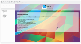
KMail is the email component of Kontact, the integrated personal information manager of KDE. |
Image map:
KWord
|
kwrite ftp://ftp.kde.org/pub/kde/Welcome.msg |
“for images that contain substantial areas of constant color a linear histogram will often be dominated by a single bar. In this case a logarithmic histogram will often be more useful.” |
![]() Support for this application can be found from the project's home page
Support for this application can be found from the project's home page
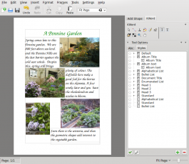
A Third Layout Project - a Photo Album Page
Template:I18n/Language Navigation Bar
 |
In our third Layout Tutorial you will again use your own pictures and text |
In this lesson you will revise the steps of the first and second tutorials:
- add text boxes and adjust their size and position
- format text
- add illustrations
- adjust their size and position
You will create a page suitable for use as a photo album page, during which we will examine text runaround and text-flow.
Plenty of white space is advisable in a photo album page, but if your margins are too large you will find that either the pictures or text suffer from lack of space. We will start by increasing the margins on our page. Use the menu entries Format > Page Layout. Set the margins to 25mm all round, then check Apply to Document.
First, place three or four photos on your page, resize them and move them until you feel you have a good balance. Now create a text frame,alongside your first picture, roughly filling the available space. In Properties, give it a recognisable name, then in the Options tab, set "Do not show the extra text". Close the properties box, and select the Text tool. The text tool options appear at the lower right of the page. Set the font style and size that you want, then either type directly into the box, or paste in ready-made text. For a photo album you probably need a much larger text style that you would use for most documents.
If your text overflows the area selected it will not be visible (due to the setting we just made). Now's the time to create a new text box alongside the second picture. Again, fill the available space. The Connect Text Frames options page will pop up. Click on the named frame you earlier created.


