Digikam/Tour d'horizon
Introduction
People who enjoy digital photography as a creative outlet are very familiar with software products from companies like Adobe™, Corel™, ACD Systems™, Bibble Labs™, Light Crafts™, and even Google™. Most of them are also likely to be familiar with what until recently was the premier open source photo editor, The Gimp. Unfortunately, the Gimp has lacked a very important feature for a lot of photographers, 16 bit per channel editing. Because of that, most serious photographers do not consider the Gimp a viable alternative. True, there is also Cinepaint, which forked off of the Gimp a few years ago, and it does offer 16 bit per channel editing. Unfortunately, its interface leaves a lot to be desired and does not seem to be heavily maintained.
Happily, there is now another open source alternative with 16 bit mode editing capabilities which appears to be getting ready to give the big guys a run for their money – digiKam. I have personally only recently discovered digiKam. Well, I had tried it before, but only since I tried its KDE SC 4 edition did I think it was ready for my use. I was actually quite surprised to see how much it has improved and how many features have been included with it. Some of its features are:
- 16 bit per channel support.
- Curves and levels tools.
- Color management support.
- White balance tool with color picker.
- Lens correction tools.
- Aspect Ratio Crop tool with several standard formats available.
- Proper black & white conversion tool.
- Batch processing.
- Tagging and searching features.
- Export to Facebook, Flickr, Picasa, etc.
And there are many, many more that I just don’t have time to even mention. Of course, digiKam is not perfect. And there are a couple of items that I expect to be improved or corrected soon. But, I assure you that if you are into photography, you are going to be hearing a lot more about digiKam in the future and, hopefully, you will be enjoying its use too.
Now, allow me to take you through a quick tour of what it is like to work in digiKam. I am currently using digiKam version 1.0.0-beta4 as found in PCLinuxOS KDE4 repositories.
RAW Editing
For this tour I decided to use this photo because of its somewhat challenging lighting.

This is a RAW image taken with my old Pentax istDS*. This is how it looks in digiKam’s editor, which by the way exists as a standalone application as well called showFoto.
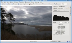
If you are familiar with histograms, you may have noticed that the histogram on this picture seems rather odd. The reason for that is that digiKam can show two different types of histograms, linear and logarithmic. The one displayed here is the logarithmic histogram, but most people are only accustomed to the linear type. One can switch between histogram types by clicking their respective little buttons above the histogram. Unfortunately, when clicking on the linear histogram button for this image all I get is a flat line. This is what digiKam’s documentation says regarding this:
“for images that contain substantial areas of constant color a linear histogram will often be dominated by a single bar. In this case a logarithmic histogram will often be more useful.”
I am sure there are technical reasons for this, but I do wonder why other programs, like Cinepaint, are able to show a linear histogram for this image just fine. I mention this because I know that some people do rely on the histogram a lot and I do think that the linear type is more useful. But I agree that having the logarithmic histogram is better than nothing. So, since this is not really a show stopper lets move on.
I am by far not a post-processing expert. My normal work-flow when editing an image is to edit the levels, adjust the saturation, crop or resize, and then sharpen the image. So, lets try to do that with this image.
Niveaux
First lets use the levels tool found under .
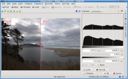
I basically just added a bit of contrast by moving the left lever (below the second histogram) to the right and lighten the image by moving the right lever to the left. The preview window adjusts automatically as I make my adjustments so that I know what the result will be.
Saturation
Now, lets increase the saturation to try to bring out the color a little. For that we use the saturation tool found under .
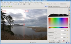
I don’t like the “Disney” look that some point and shoot cameras default to with supper saturated colors. I like to keep my images somewhat realistic looking. So I don’t like to bump the saturation too much. I feel that, for this picture, that amount of saturation is just enough to give it a bit of life without going too far into cartoon land.
Cropping
Now I am going to crop the image. This is really an important step if you are planning on printing the image. If you have ever taken your DSLR images to be printed without cropping them first, you may have been unpleasantly surprised by the fact that they were not centered correctly, or that an important part of the image was left out. The reason for this is that the image you gave them did not have the same proportions as the paper you asked them to print it on. And so they had to crop it for you. To prevent that from happening you need to crop your images to the same proportions of the paper you will be printing on. Yes, that means that you will need a different image if you want to print 8×10 than if you want 5×7, 14×20, etc. Fortunately, digiKam makes this step a breeze with its aspect ratio crop tool found under .
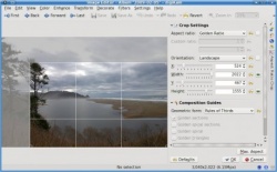
As you can see I chose to use the “Golden Ratio” option for this image, but digiKam has predefined settings for all the common printing paper ratios in the market and even allows you to choose a custom ratio if you desire.
Sharpening
The final step in my photo processing work-flow is to sharpen the image. I am used to using the method for this purpose, but in reading digiKam’s documentation I was surprised to learn that they actually recommend the method as a way to obtain better results. This is how the Sharpen tool looks, found under .
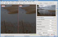
As you can see, you can change the sharpening method used with a drop down button. You can zoom in to the image as much as you want using the button, and you can move the zoom window around in the small preview image above the settings area. I was conservative in the amount of Circular sharpness specified because I could see in the preview area that going for more would result in a lot of grain being visible. This amount improved the sharpness significantly while still retaining the smooth look of the overall image. This is my final result.

As you can see, there is quite a bit of improvement over what we started with.
Auto-Correction
Normally I would have been content with leaving it at that. But since I am still in the exploring digiKam mode, I decided to test some of the tools available. To do that, I went back to the original RAW image, and after importing it, I went straight into . This is what it looks like.
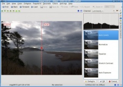
As you can see, there are five automatic correction levels that you can choose from to improve your image. In most images that I have tried this with, the option gives the best results. However, in this particular image the result was too dark. I had not seen any image for which the option resulted in an improvement, but for this particular image the results it gave me were surprisingly good. This is what the digiKam documentation says about the method of :
"Equalize: this method adjusts the brightness of colors across the selected image so that the histogram for the Value channel is as flat as possible, that is, so that each possible brightness value appears at about the same number of pixels as each other value. Sometimes Equalize works wonderfully at enhancing the contrasts of an image. Other times it gives garbage. It is a very powerful operation, which can either work miracles on a image or destroy it."
Well, looks like they were not kidding. My image turned out much better using this method of correction instead of my normal level adjustment step. This is how the image looks after adding saturation, cropping it, and sharpening it.

Conclusion
Without a doubt digiKam has a lot to offer for the photographers among us. Unfortunately, it still has one glaring omission – a clone tool. You may have noticed that the original RAW image had some dust specks in the sky above the trees and in other parts of the clouds. In digiKam, the only tool available for trying to remove such things (other than cropping them out as I did here) is a tool called , found under . However, that tool is not easy to use and is rather slow. With a proper clone tool, as available in most other photo editors, removing such items only takes a few seconds. The good news is that the digiKam developers have acknowledged this omission as a bug and we can expect to see it implemented in a future version of digiKam. In the mean time we can use the Gimp to take care of these items as a final touch up step.
I think you will agree that digiKam is an amazing open source tool. It has now become my main photo editor. If you are into photography, why not give it a try?
This page was written in October 2009. Can you add to it, talking about a later version?

