KWord/Tutorials/ThirdLayout: Difference between revisions
Marked this version for translation |
No edit summary |
||
| Line 23: | Line 23: | ||
<!--T:6--> | <!--T:6--> | ||
Plenty of white space is advisable in a photo album page, but if your margins are too large you will find that either the pictures or text suffer from lack of space. We will start by increasing the margins on our page. Use the menu entries <menuchoice>Format -> Page Layout</menuchoice>. Set the margins to 25mm all round, then | Plenty of white space is advisable in a photo album page, but if your margins are too large you will find that either the pictures or text suffer from lack of space. We will start by increasing the margins on our page. Use the menu entries <menuchoice>Format -> Page Layout</menuchoice>. Set the margins to 25mm all round, then hit <menuchoice>OK</menuchoice>. | ||
<!--T:7--> | <!--T:7--> | ||
Revision as of 15:41, 20 April 2011
A Third Layout Project - a Photo Album Page
 |
In our third Layout Tutorial you will again use your own pictures and text |
In this lesson you will revise the steps of the first and second tutorials:
- add text boxes and adjust their size and position
- add illustrations
- adjust their size and position
You will also
- link text frames and
- set up paragraph and text styles.
You will create a page suitable for use as a photo album page, during which we will examine text-flow.
Plenty of white space is advisable in a photo album page, but if your margins are too large you will find that either the pictures or text suffer from lack of space. We will start by increasing the margins on our page. Use the menu entries . Set the margins to 25mm all round, then hit .
It is advisable to do a little preparation for pages such as this. Bear in mind that photos as they come from your camera are large. Putting three or four of them, unedited, on a page will result in a page that may not print for a very long time, if at all. It may even crash your printer. Instead, create a temporary folder and copy into it all the pictures you intend using. Then use digiKam to resize those pictures to approximately the size you want to use on the page.
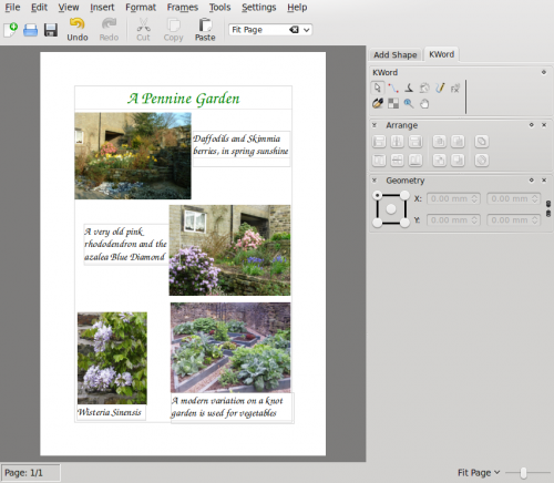
Now, place three or four photos on your page and move them until you feel you have a good balance. Create a text frame, alongside your first picture, roughly filling the available space. Take care that the first text frame touches the left-hand margin. This is because frames that are in that position are treated as a column, so no other text frame should touch unless you specifically want it to be treated as such. If you encounter any problems with text flowing through boxes in the wrong order, this is the likely cause, and you may need to re-position the boxes on your page to avoid that margin.
In , give your text frame a recognisable name, then in the tab, set . Close the box, and select the tool. The text tool options appear at the lower right of the page, assuming you have the docker showing. For a photo album you probably need a much larger text style that you would use for most documents, so now we will create text styles for use in this kind of page.
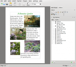
Click on the File:List-add.png under the list and create a paragraph style called Album Title. A text style will be created in association with it. Selecting the character style, use the ![]() to set the font and size. I used URW Chancery L, 36 point for my title, and set the colour to green, to match the subject. Go back to the paragraph style and under set the alignment to . Create another for Album Text, using the same font and 22 point size, leaving the text colour and paragraph alignment at the defaults. One last thing - go back to the Album Title Paragraph configuration and set the next paragraph to Album Text. Any changes you make in these configurations will affect all paragraphs that use these styles.
to set the font and size. I used URW Chancery L, 36 point for my title, and set the colour to green, to match the subject. Go back to the paragraph style and under set the alignment to . Create another for Album Text, using the same font and 22 point size, leaving the text colour and paragraph alignment at the defaults. One last thing - go back to the Album Title Paragraph configuration and set the next paragraph to Album Text. Any changes you make in these configurations will affect all paragraphs that use these styles.
Return to your first text box, then either type directly into the box, or paste in ready-made text. If your text overflows the area selected the rest will not be visible (due to the setting we made earlier). To add your Album Text style, place the cursor within the paragraph, select the style from the list, then ![]() will apply it.
will apply it.
Now's the time to create a new text box alongside the second picture. Again, fill the available space. The options page will pop up. Click on the named frame you earlier created. Again, in the , set . Your existing text will flow into this frame. For each new paragraph you will need to apply the Album Text style. Continue adding text frames and text as required.
This style of album page is useful if, for instance, you need a narrative style to accompany the pictures. On the other hand, often just captions are better.

This page shows two methods - one by adding text frames alongside the relevant photo, and the other by adding text frames below, as a caption. In the case of true captions like this, the text frame and photo should be grouped, to ensure that they don't get separated. Remember that this is for demonstration purposes only - mixing the styles like this is not aesthetically pleasing.
Experiment with paragraph and text styles, and layout. Enjoy creating pages to share with family and friends!
